🪔 YADNIYA – Branding a Sacred Offering for the World
Client: Mali’s Agnihotra Products – Mr. Dnyandev Mali
Industry: Spiritual, Health, Agriculture, Eco Products
Project Type: Branding from Scratch (Naming, Design, Identity, Packaging, Web)
1. The Challenge
Mr. Mali had been producing smokeless cow dung cakes (CDCs) since 1982 for Agnihotra. Despite a high-quality product and decades of organic growth, his offerings lacked a distinct identity, packaging, or brand recognition — especially for a broader, international market. The goal was to create a new brand that felt authentic, traditional, and spiritually rooted yet appealing to a global audience.
2. Strategy & Insight
We explored Sanskrit for naming, respecting the sacred purpose of the product. “Yadniya” was chosen for its layered meaning — sacred, pure, godly, worthy of offering — aligning perfectly with the product’s purpose.
Through competitor analysis, we identified gaps: existing CDCs were poorly shaped, smoked excessively, and used lower-quality materials. This informed both product strategy and design direction.
3. Brand Story
Yadniya’s roots go back to one man’s realization that spiritual purity should begin with physical purity. Unable to find clean cow dung cakes in 1980, Mr. Mali began producing his own from the Khillari breed, hand-shaped for Agnihotra. As awareness grew, so did demand -locally, then nationally. Today, Yadniya stands not only as a product but as a mission: to promote wellness, ritual purity, and environmental harmony.
4. Messaging Pillars
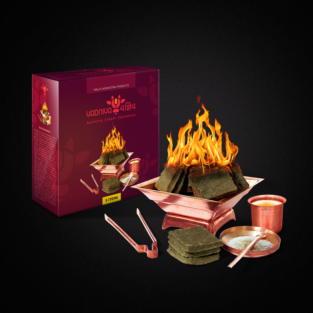
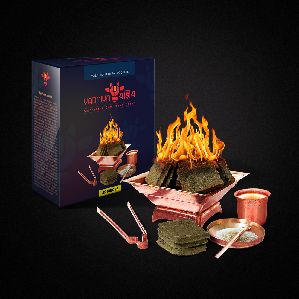
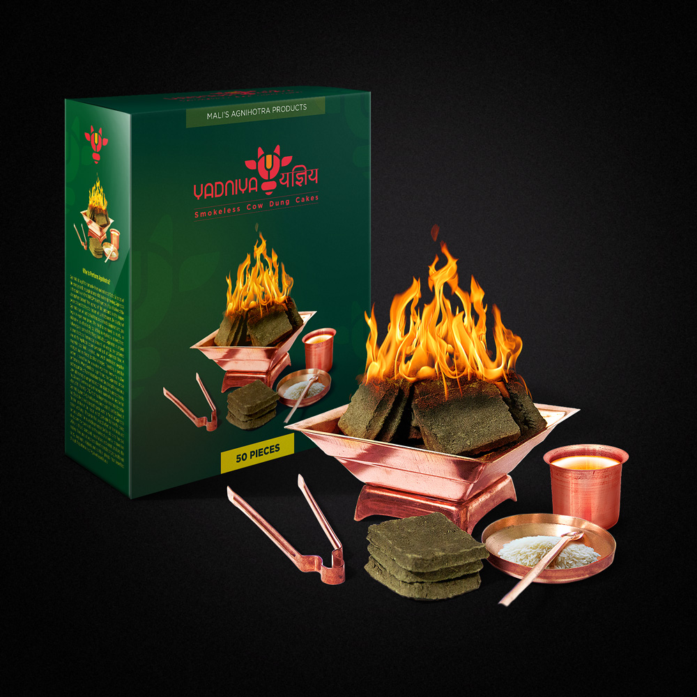
• 100% hand-crafted from Khillari Indian cow dung
• Zero smoke, zero trash — just pure sacred fire
• Breakless, biscuit-shaped for global delivery
• No chemical additives — just ghee needed
• Packaging designed for both tradition & export
• Supports daily rituals & eco-conscious lifestyles
5. Creative Execution
We developed a cohesive identity system rooted in spiritual minimalism and Indian symbolism:
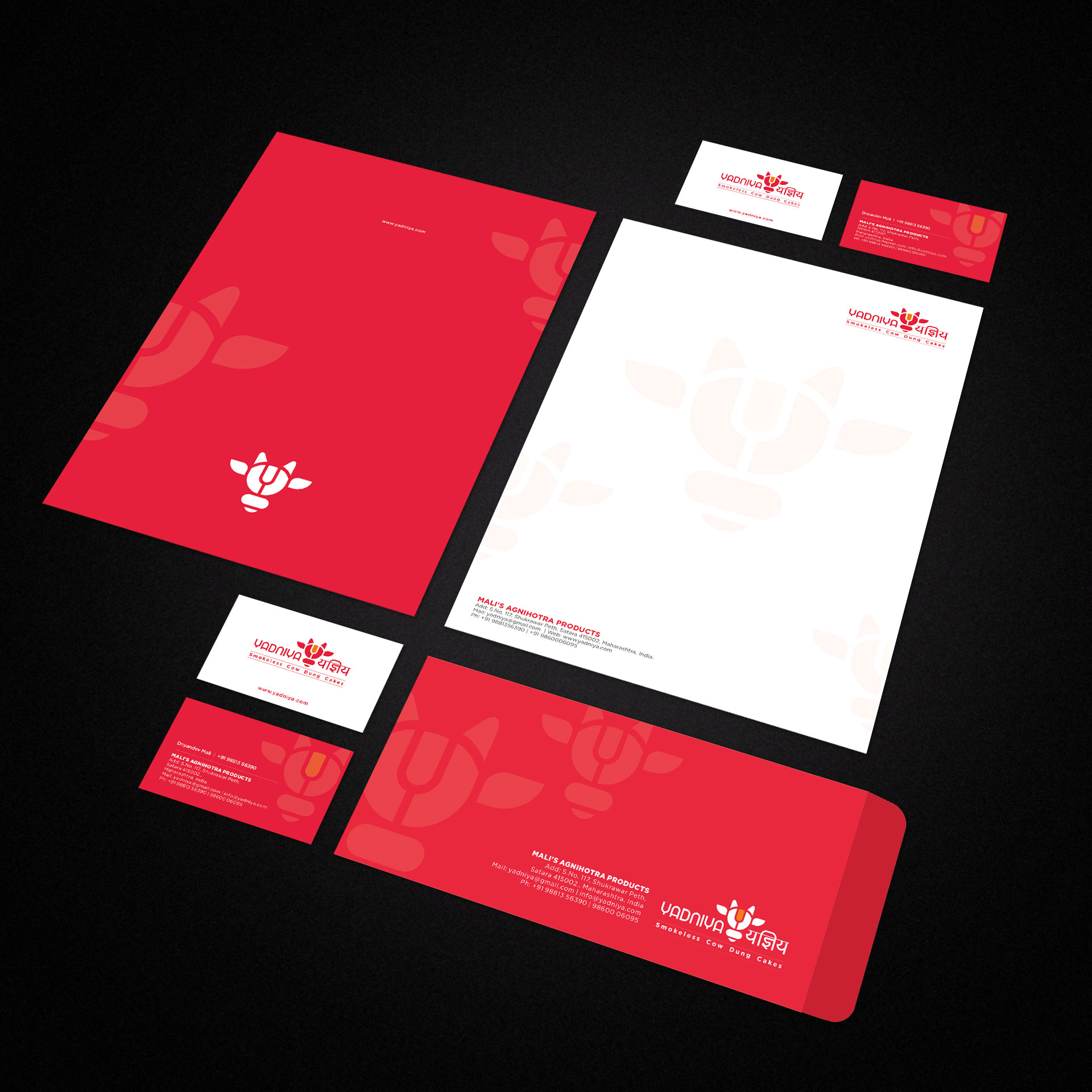
• Logo: A symmetrical geometric cow face with a sacred flame, bridging tradition and modernity
• Typography: Bilingual identity (Devanagari + English) to honor Indian heritage and reach global users
• Color Palette: Warm reds and saffron orange — symbolic of fire, purity, and offering
• Packaging & Stationery: Clean, modular designs with spiritual motifs
• Website: Custom design to narrate the founder’s story, educate about Agnihotra, and showcase products.
6. Results
While formal feedback is awaited, early impressions from the target audience and distribution partners indicate significantly improved brand recall, trust, and readiness for global retail. The identity system is now export-ready and scalable.
7. Visual Showcase