🌸 Saimudra Inc. – The Divine Impression
1. Client Overview
Business: Designing & Printing, Notebook Manufacturing, Custom Services
Industry: Printing & Notebook Manufacturing
Founded: 1982 as Sai Mudranalay (tradel printing & binding)
Rebranded: To Saimudra Inc. – with expanded services including creative design, offset printing, notebooks, and custom solutions.
2. The Challenge / Brief
The original brand, Sai Mudranalay, carried strong spiritual meaning, trust, and legacy. However, with the addition of design, printing, and notebook manufacturing services under the next generation, the business needed a modern rebrand that:
• Retained spiritual essence & connection to Sri Sathya Sai Baba
• Built trust with loyal customers while appealing to newer audiences
• Reflected expanded services and modern printing technology
3. Research & Insights
• Explored Sanskrit/Marathi roots of the name to keep continuity.
• Developed “Saimudra” — combining Sai (divine, master, saint) with Mudra (stamp, impression, print).
• Tagline “The Divine Impression” — dual meaning:
1) High-quality, lasting impression of printing & services.
2) Spiritual gesture of blessing (mudra) from Sri Sathya Sai Baba.
• Competitive insight: In printing industry, businesses often collaborate – brand differentiation came more from trust, design expertise, and notebook specialization rather than price wars.
4. Brand Strategy
• Positioning:
Reliable, trusted partner for industrial printing and educational notebooks.
• Personality:
Professional, Spiritual-rooted, Trustworthy, Quality-focused.
• Tone of Voice:
Authoritative yet approachable; confident, sincere, and service-driven.
5. Brand Story
Founded in 1982 with the vision of self-reliance, Saimudra grew from traditional printing to a modern printing & notebook hub. Carrying forward spiritual values of sincerity and service, the rebrand ensures continuity with the past while embracing modernity.
6. Messaging Pillars:
• Reliable design & printing solutions since 1982
• Trusted notebook provider for schools, colleges & institutions
• Strong spiritual foundation → ethical, sincere services
• Creative advantage through sister brand Ekameva Media
• Affordable, customized, and doorstep delivery printing services
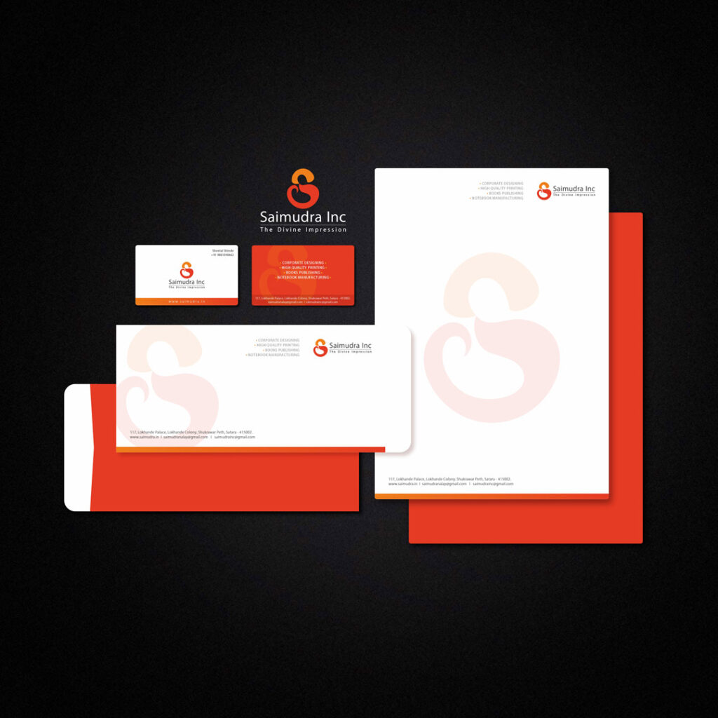
5. Creative Execution
Deliverables:
• Brand Name & Logo,
• Basic Guidelines,
• Stationery,
• Website
Design Thinking:
• Naming: Saimudra Inc. — shorter, modern, symbolic, yet spiritually rooted.
• Tagline: “The Divine Impression” — blends printing expertise with spiritual symbolism.
• Symbol: Hidden “S” → doubles as form of Sri Sathya Sai Baba in blessing gesture. Subtle, not explicit, keeping spiritual respect while maintaining brand aesthetics.


• Typography: Kozuka Gothic Pro — modern, simple, clear, youthful.
• Colors: Dark Orange – Sai Baba’s robe, passion, trust, strength & Saffron – divine light, purity, spiritual essence.
6. Before & After
7. Feedback /Results
• Impact: Improved recognition, stronger brand recall, growth in customer base.
• Trust: Legacy of spiritual name retained, making transition seamless.
• New Opportunities: Now recognized as a leading notebook supplier for schools, colleges, institutions, and industrial clients.
8. Visual Assets