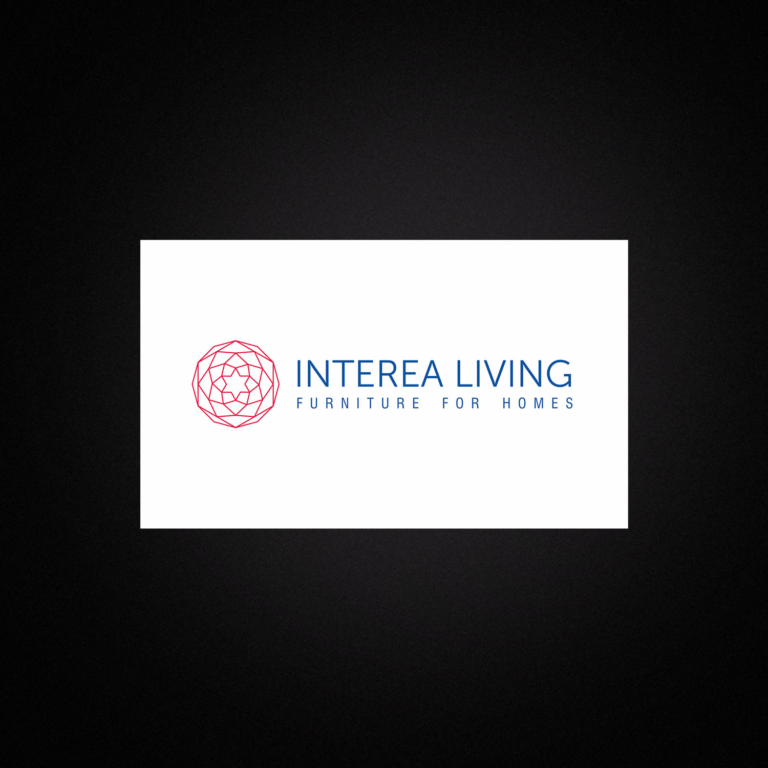
🌟 INTEREA LIVING – Furniture for Homes
1. Client Overview
Business: Furniture for Homes
Industry: Franchise Industry (Subdivision / Brand of Tataria Group)
Project Type: Branding from Scratch (Naming, Logo Design, Brand Identity)
Interea Living is a franchise brand under Tataria Group, dedicated to delivering stylish, high-quality furniture solutions exclusively for homes.
2. The Challenge / Brief
The client required a unique and memorable brand name for their new home furniture franchise business, with an available domain (.in / .com) for digital presence.
- Type: New Sub Brand
- Goal: Differentiate from parent brand while retaining synergy.
- Key Problem: High competition in furniture industry with many generic names.
- Pain Points in Old Identity: None, as it was a fresh brand launch.
3. Research & Insight
The biggest challenge was creating a name that felt familiar yet distinct in the saturated furniture industry. Competitor research showed that most brands used either generic or descriptive names.
- Explored words that evoke home, design, interiors, and lifestyle.
- Since the client wanted a short, single-word name, we modified the word “Interior” → “Interea”, giving it originality while retaining a connection to interior spaces.
- Even though the focus was home furniture, the name was designed to resonate across residential, commercial, and retail spaces if needed.
Audience Insight: The audience seeks premium, stylish, and functional furniture—positioning the brand to speak to aspirations, lifestyle, and trust.
4. Brand Strategy
• Positioning:
Ideal for Homes.
• Personality:
Premium, reliable, modern, and aspirational.
• Tone of Voice:
Confident, elegant, and approachable with an emphasis on quality and lifestyle.
5. Brand Story
• Why Interea Exists:
To provide stylish, functional, and durable furniture tailored for modern homes.
• It’s Origin:
Born as a subdivision of Tataria Group, focusing exclusively on home spaces.
• Values & Vision:
Comfort, style, quality, and innovation.
• Target Audience:
Upper Middle-Class & Upper-Class families seeking long-lasting and elegant furniture solutions.
• Differentiator:
Unique designs, original identity, and premium materials for sophisticated living.
6. Messaging Pillars:
• Unique & functional designs.
• Furniture that combines style with comfort.
• A brand built on trust, quality, and lifestyle enhancement.
7. Creative Execution
Deliverables:
• Brand Name & Logo
• Basic Brand Guidelines.
Design Thinking:
• Symbol: Explored floral and crystal forms to capture beauty and refinement. Finalized a geometric star-shaped emblem symbolizing quality, luxury, and harmony. The interconnected lines suggest craftsmanship and durability—mirroring facets of a diamond.
• Typography: Museo Sans 300 – simple, modern, and legible. Minimalism conveys premium positioning.
• Color Palette: Neon Red (Symbol): Passion, creativity, and attention & Custom Dark Blue (Typography): Reliability, trust, and professionalism.
8. Client Feedback / Results
The brand is currently in the “coming soon” phase under its parent company Tataria Group.
• Client Reaction: Awaiting feedback.
• Early Metrics: To be evaluated post-launch.
9. Visual Assets
