Visual Identity Case Study for Kelone Industries
1. Client Overview
What does the business do?
Kelone Industries is a sub-brand of Tataria Group, specializing in modular kitchen hardware and related products.
Industry: Modular Kitchen Hardware & Fittings
The brand was developed to establish a distinctive identity in the kitchen hardware segment, communicating product relevance, quality, and reliability through a modern visual language.
2. The Challenge / Brief
What was the client's goal?
The objective was to create a unique logo and brand identity for Kelone Industries, supported by basic brand guidelines.
As the name Kelone had no predefined meaning connected to its products, the primary challenge was to establish a meaningful visual association with modular kitchen hardware without compromising the brand's premium, professional appearance.
New brand or rebranding?
Kelone Industries was developed as a new sub-brand under Tataria Group.
Key challenge:
Establish a distinctive identity for a name without an established product association.
Connect the logo visually to modular kitchen hardware.
Communicate quality, trust, and professionalism through typography and colour.
Create a clean, memorable identity suitable for business and product applications.
3. Research & Insight
Research and discovery process
The central design question was: How can an unfamiliar brand name communicate what the business does without relying on a descriptive name?
Rather than forcing a literal meaning onto the name, the approach was to integrate a subtle visual reference to the product category directly into the logotype.
Modular kitchens are characterized by organized layouts, functional structures, and precisely fitted components. Viewed from above, a kitchen layout often forms an L-shaped configuration.
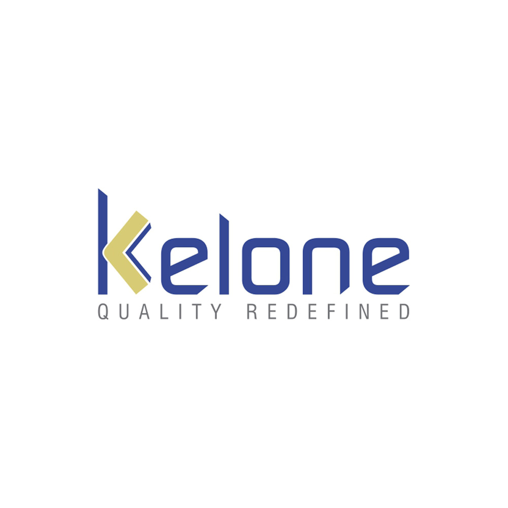
This observation inspired the idea of incorporating a stylized kitchen layout into the initial letter K, creating a visual connection between the brand name and its product category.
Key insight
The product itself could become part of the brand identity. By embedding a kitchen-inspired form into the letter K, the logo could communicate relevance while preserving a simple, premium, and recognizable appearance.
4. Brand Strategy
Brand positioning
A quality-focused modular kitchen hardware brand offering products for modern kitchen spaces.
Brand personality
Reliable: Communicates confidence and trust.
Professional: Reflects a structured, business-oriented approach.
Modern: Connects with contemporary kitchen design.
Quality-conscious: Emphasizes product standards and refinement.
Premium: Creates a polished and distinctive brand impression.
Tone of voice
Professional, confident, precise, and reassuring. The communication should emphasize product quality, functionality, reliability, and thoughtful design without unnecessary exaggeration.
Brand story
Why the brand exists
Kelone Industries was created to establish a distinct brand identity for modular kitchen hardware, presenting its products through a consistent and quality-focused brand experience.
How it came to be
As a sub-brand of Tataria Group, Kelone Industries required a separate identity that would distinguish it within the modular kitchen hardware market. With no established meaning attached to the name, the branding approach focused on creating product relevance through visual design.
What it stands for — values and vision
Kelone represents a commitment to quality, reliability, functionality, and contemporary design. Its intended direction is to build a recognizable identity associated with dependable kitchen hardware solutions.
Who it serves — target audience
Modular kitchen manufacturers and dealers
Interior designers and architects
Furniture and cabinetry manufacturers
Contractors and builders
Retailers and hardware distributors
Customers seeking modern kitchen solutions
What makes it different — intended value proposition
The identity integrates a subtle representation of a kitchen layout into the brand name itself, helping establish a connection between Kelone and its product category. This distinctive visual approach supports brand recognition while maintaining a professional aesthetic.
Messaging pillars
The following pillars can guide Kelone's future brand communication:
Quality you can trust — Emphasize dependable products and consistent standards.
Designed for modern kitchens — Connect the brand with contemporary kitchen layouts and functionality.
Precision in every detail — Communicate the importance of fit, finish, and practical design.
Professional reliability — Build confidence among manufacturers, dealers, and trade partners.
Refined functionality — Position kitchen hardware as an essential part of a well-designed kitchen.
These are recommended messaging pillars based on the brand's intended positioning, not claims of independently verified product performance.
5. Creative Execution
Deliverables created
Brand naming application and logo design
Brand colour palette
Typography selection
Basic brand guidelines
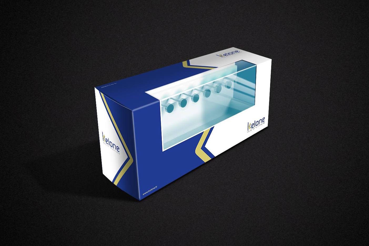
Product Packaging Designs
Design thinking behind the identity
1. Product-inspired symbolism
The defining feature of the logo is the stylized K, designed to incorporate an L-shaped form inspired by a modular kitchen viewed from above.
This creates an indirect visual reference to the product category without turning the logo into a literal illustration of a kitchen. The concept helps connect the otherwise unfamiliar name with the brand's business purpose.
2. Three-dimensional treatment
A subtle 3D extrusion effect was applied to the stylized kitchen-inspired form, adding depth and dimension to the symbol while helping it stand apart from the wordmark.
3. Typography — Continuum Medium
Continuum Medium was selected for its geometric, rounded letterforms and contemporary appearance. Its rounded corners complement the smooth, refined character of kitchen hardware, while its clean construction maintains readability and a professional visual presence.
4. Colour palette
The identity combines custom shades of blue and yellow-green to balance reliability with freshness.
Custom blue: Represents trust, professionalism, stability, and corporate reliability.
Yellow-green: Suggests renewal, growth, freshness, and distinction. Its use in the kitchen-inspired K highlights the product connection within the wordmark.
The contrast between the two colours gives the identity a clear visual hierarchy without making the overall design feel overly complex.
5. Tagline — “Quality Refined”
The tagline was selected from several options to communicate the brand's focus on quality in a concise, memorable way.
“Quality” establishes the intended standard of the products, while “Refined” suggests precision, thoughtful design, and attention to detail. Together, the words support Kelone's positioning in the modular kitchen hardware segment and complement the logo's clean, contemporary aesthetic.
6. Before & After
As Kelone Industries was developed as a new sub-brand, a traditional before-and-after comparison was not applicable.
Instead, the case study can demonstrate how the naming, product-inspired symbolism, typography, colour palette, and tagline came together to establish a distinct visual identity.
7. Client Feedback & Results
Brand development outcome
The project established the foundational brand identity for Kelone Industries through a custom logo, a defined colour palette, typography selection, and basic brand guidelines.
Client feedback and measurable results
Formal client feedback and measurable performance data have not been provided. Therefore, improvements in brand recognition, perception, or business growth should not be presented as verified outcomes.
The case study can instead highlight the strategic intent and design decisions behind the identity.
8. Visual Assets