🏃♂️ MAS Marathon 2022 – Event Branding Case Study
Client: MAS (Manufacturers’ Association of Satara)
Service: Event Branding (Theme, Logo, Tagline)
Agency: Ekameva Media
1. Client Brief / Theme
MAS approached Ekameva Media to develop a compelling identity for its first-ever MAS Marathon — an initiative to:
• Create fitness awareness among industrial workers
• Promote tree plantation within industrial campuses for better environmental and employee health
• Celebrate 75 years of Indian Independence with purpose and unity
The brief called for:
• An event theme introduction
• A logo design
• A tagline that reflects both the spirit of the event and the identity of the workers it represents
2. Theme Introduction Developed by Ekameva Media
At least one-third of our daily life is spent at the workplace, often exposing industrial workers to hazards like noise, chemicals, physical strain, and mental stress. The pillars of any manufacturing industry are built on the well-being of its workforce.
Running is a universal, low-cost solution to many of these challenges — a catalyst for physical and mental transformation. It supports cardiovascular health, quality sleep, memory, immunity, and emotional resilience.
In alignment with the 75th year of Indian Independence, MAS organized the MAS Marathon 2022 on August 14, followed by a Tree Plantation Drive on August 15 across industrial campuses — symbolizing rebirth, healing, and a sustainable future.
Though targeted at industrial workers, the event was open to all — emphasizing the shared need for health, positivity, and environmental care in modern life.
3. Brand Strategy
Objective: To design a memorable and meaningful event identity that:
• Reflects the industrial roots of the organization
• Connects with the patriotism and collective spirit of Independence Day
• Encourages participation, pride, and progress
Tone: Energetic, Empowering, Purpose-driven
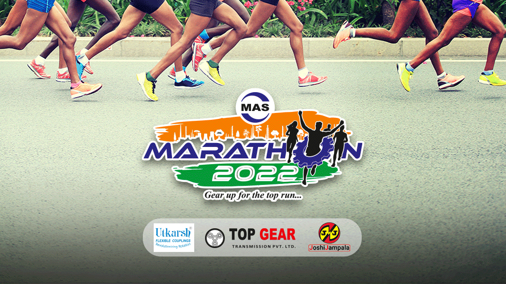
4. Logo Design
Design Elements & Rationale:
• MAS Logo at Top Center: Signifies MAS as the event’s sponsor and initiator.
• Tri-color Brush Strokes: Represent India’s national pride and artistic spirit, aligning with the 75th Independence Day celebration.
○ Orange Stroke: Features an industrial skyline and trees, visually merging productivity with ecological awareness.
○ Green Stroke: Hosts the event year “2022”, maintaining balance and structure in the visual hierarchy.
• Typography: Bold, squarish, and italic — symbolizing industrial power, motion, and momentum.
• Color Palette: MAS’s brand colors:
○ Blue for the event name – symbolizes trust, strength, and professionalism
○ Black for human figures – conveys resilience and energy
• Creative Typography Twist:
○ The ‘O’ in ‘Marathon’ is reimagined as a 3D gear — carried by a running figure in a victory pose.
○ Symbolizes industrial progress, movement, and achievement.
5. Tagline & Meaning
“Gear up for the top run…”
Breakdown:
• “Gear up”: Industrial lingo that encourages preparation and readiness, with a nod to machinery and motion.
• “Top run”: Dual meaning — refers to both the marathon event and the ambition to rise in life, work, and wellness.
The tagline is designed to:
• Motivate workers to invest in their own health and future
• Inspire a broader community transformation
6. Impact & Outcome
Although the event was held for the first time, the branding helped MAS:
• Present a professional and unified identity
• Attract attention and participation beyond just industrial workers
• Visually connect health, patriotism, and sustainability in one strong narrative
Deliverables:
• Event Logo Design
• Tagline
• Event Theme Copywriting
• Brand Color Application Guidance (for banners, medals, social media, etc.)
7. Visual Assets
8. 📌 Summary
The MAS Marathon branding project showcases how design, storytelling, and cultural insight can come together to energize a local initiative with national relevance. Through symbolism, typography, and color, Ekameva Media delivered an identity that celebrates not just Independence, but also interdependence — of health, environment, and industry.